
The Map That Shouldn't Exist: The High-Tech Mystery of the Carte Pisana
May 12, 2026.

Podcast Analysis
History is usually a story of slow, steady progress—a series of “beta tests” leading to a finished product. But every once in a while, an artifact appears in the record that feels less like a step forward and more like a “glitch in the timeline.”
Enter the Carte Pisana.
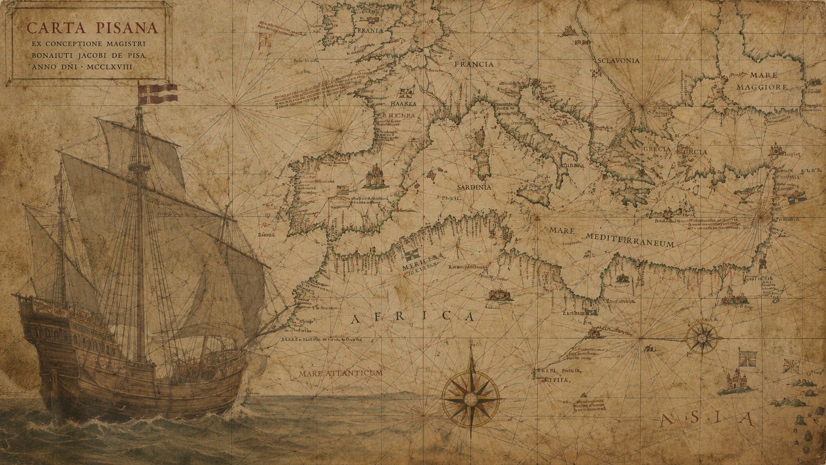
Discovered in the mid-19th century in the hands of a Pisan family, this single piece of calfskin dates back to the late 1200s. At first glance, it looks like a typical medieval artifact. But when you look closer, you find a level of mathematical precision that shouldn’t have existed for another three hundred years.
The Discovery: A Bolt from the Blue
Before this map appeared, European “maps” were mostly symbolic. They were called Mappa Mundi, and they were more interested in showing the location of the Garden of Eden or mythical monsters than actual geography.
Then, around 1275, the Carte Pisana emerged. It was the first “Portolan” chart, a map designed not for prayer, but for survival. It stripped away the myths and replaced them with a cold, hard, and shockingly accurate outline of the Mediterranean and Black Seas.
Anomaly I: The Ghost Lineage
The most unsettling thing about the Carte Pisana is its lack of “parents.”
In the world of technology, we expect to see evolution. We should see “bad” maps slowly becoming “okay” maps before we get a “great” map. But the Carte Pisana has no predecessor. It appears in the historical record fully formed, with a level of coastal accuracy that aligns almost perfectly with modern satellite imagery.
Where is the “Version 1.0”? Where are the centuries of rough drafts required to compile this much data? It’s as if a 13th-century sailor was suddenly handed a GPS and told to draw what he saw.
Anomaly II: The Data Processing Feat
To create a map this accurate in the 1200s, you couldn’t just climb a tall mountain. You had to sail. You had to record the speed of your ship, the direction of the wind, and the time spent traveling between thousands of points.
The Carte Pisana represents a massive data-processing achievement. Someone had to take thousands of messy, handwritten ship logs from different captains, all using different measurements and “average” them into a single, perfect geometric outline. In an era of parchment and quill pens, the sheer computational power required to “clean” that data is staggering.
Anomaly III: The Hidden Geometry
If you look at the “bones” of the map, you’ll see a web of crisscrossing lines known as “rhumb lines”. These aren’t just for decoration; they are centered on two massive, invisible circles scratched into the vellum.
These circles allowed sailors to calculate a constant compass heading over open water, a “high-tech” leap that required an advanced understanding of trigonometry and geometry. The precision of these circles on an irregular, organic medium like calfskin suggests the use of drafting tools and standardized units (the “Portolan Mile”) that don’t match any other European system of that time.
Anomaly IV: The Standard Mile
The Carte Pisana uses a specific unit of measurement often called the “Portolan Mile”.
This unit doesn’t perfectly match the Roman mile or any other standard European measurement of the 13th century. Where did this unit of measurement come from?
The “Lost Library” Theory
How do we explain a map that is better than the ones made 100’s of years after it?
Some researchers suggest it might be a remnant of an even older, lost mapping tradition. Perhaps from the Library of Alexandria or an ancient civilization that had mapped the Mediterranean long before the “Dark Ages” began. Perhaps remnants of Greek or Phoenician surveying techniques, that had been buried for centuries. It’s as if the 13th century creator found an ancient “hard drive” of data and re-skinned it for their own time.
Final Thoughts
We like to think that progress is a straight line going up. But the Carte Pisana is a reminder that humanity can possess incredible truths, only to lose them to time, secrecy, or institutional decay.
When we look at the “neck” of the calfskin on the edge of the map, we see a bridge between two worlds: a primitive, medieval material housing a sophisticated, scientific truth. It reminds us that the greatest mysteries of our history aren’t always what’s coming in the future, but what we’ve already forgotten from our past.
What do you think? Was the Carte Pisana a lucky stroke of genius, or are we looking at the remnants of a lost era of high precision mapping?

The bit about progress not being a straight line, and the idea that some of our sharpest tools get lost to time and institutional decay, lands a lot. Lately I keep bumping into work that feels like this map: precise for the moment, with its real history half‑erased.
Piri Reis is another, check out Antarctica.